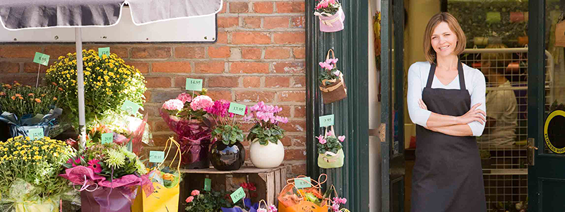
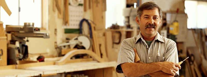
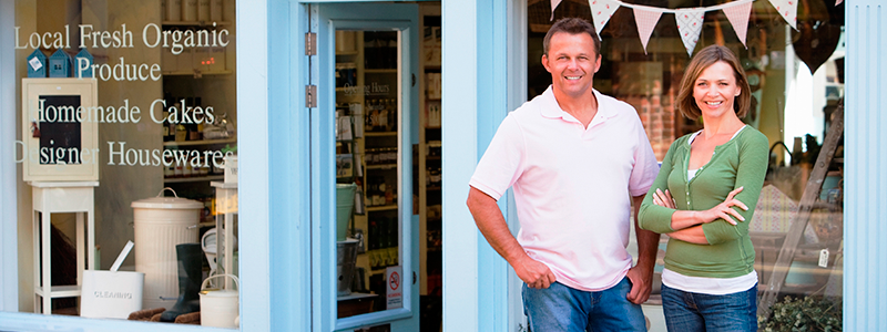
you've got a lot to do
just running your business
Why not let us take care
of your website?
we create the design
develop the content
And deliver the finished
Product to you
we'll host your website
on our secure servers
and make needed updates
to keep it looking fresh

your website is an
awesome tool
Let us get it working
for your business
We Create Beautiful Websites
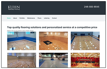
The Kuhn Specialty Flooring site uses a portfolio design to display the beauty of the floors they create.
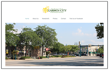
The Garden City Downtown Development Authority website highlights events with with detailed stories and photo galleries.
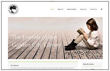
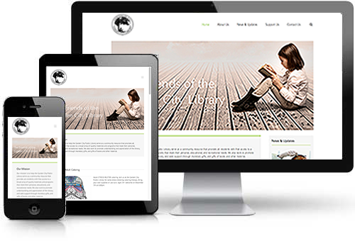
The Friends of the Garden City Library website details the Friends fundraising activities and community involvement.
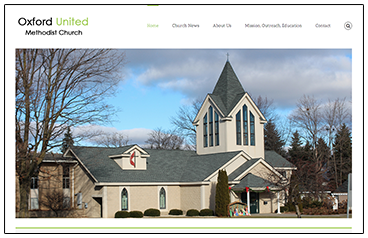
The Oxford United Methodist Church website was designed to communicate news and updates in an accessible format.
Our Sites Look Good on Mobile Devices
Palmerworks websites are designed to look good on any device. The technical term for this is “responsive design.” It adapts to many screen sizes thanks to its responsive capabilities:
- Automatically responds to the screen size of the device
- Looks good on desktops, laptops, tablets, and smart phones
- Offers ease of use for reading and navigation
- Changes the menu to touch swipe functionality on smaller devices
- Keeps the clean, modern design all the way down to smaller screen sizes
The Palmerworks site is an example of a responsive site. Every element has been tweaked for different screen sizes to make sure it looks great no matter what the device. Try resizing your browser window to see the adaptation.
Call or email us today to discuss how we can create a professional, responsive site for your company or organization.